Berger’s Books
This article was originally published by Grafik in 2016, on the occasion of John Berger’s 90th birthday.
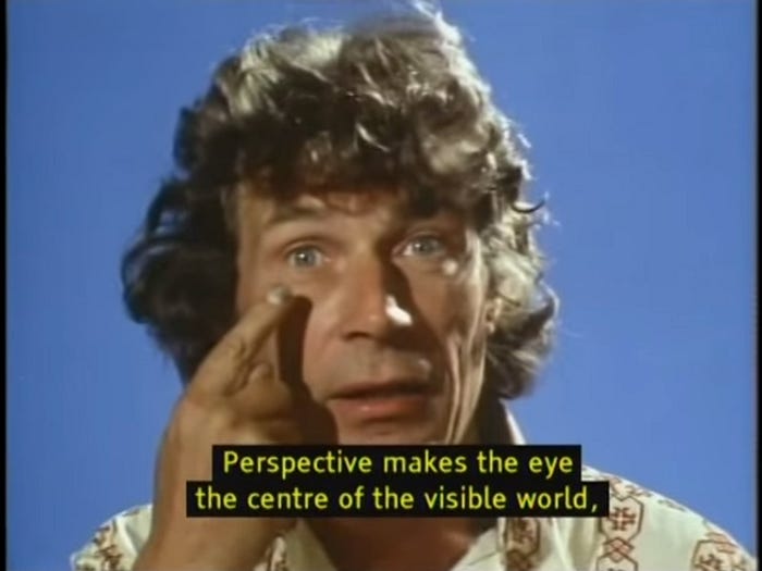
John Berger has been hugely influential in the fields of art, literature, art history and criticism, but his approach to books as collaborative projects has also left an indelible mark in the world of graphic design. Especially some of his earlier works which integrated text and image in an influential and memorable way, with the roles of writer, designer, editor and photographer working closely together to create a more unified vision. Collaboration is one of the main words that always seems to come up in discussion of Berger’s varied, but always socially and politically engaged, body of work. The term most often applied, both by himself and others, is ‘storyteller’, his writing has an incredible directness and a clear sense of purpose. At times this storytelling was not just written or oral, it was visual. Most obviously in his film and television work, but also in his printed books. In honour of his ninetieth birthday I’m going to look at a selection of them from a design perspective.
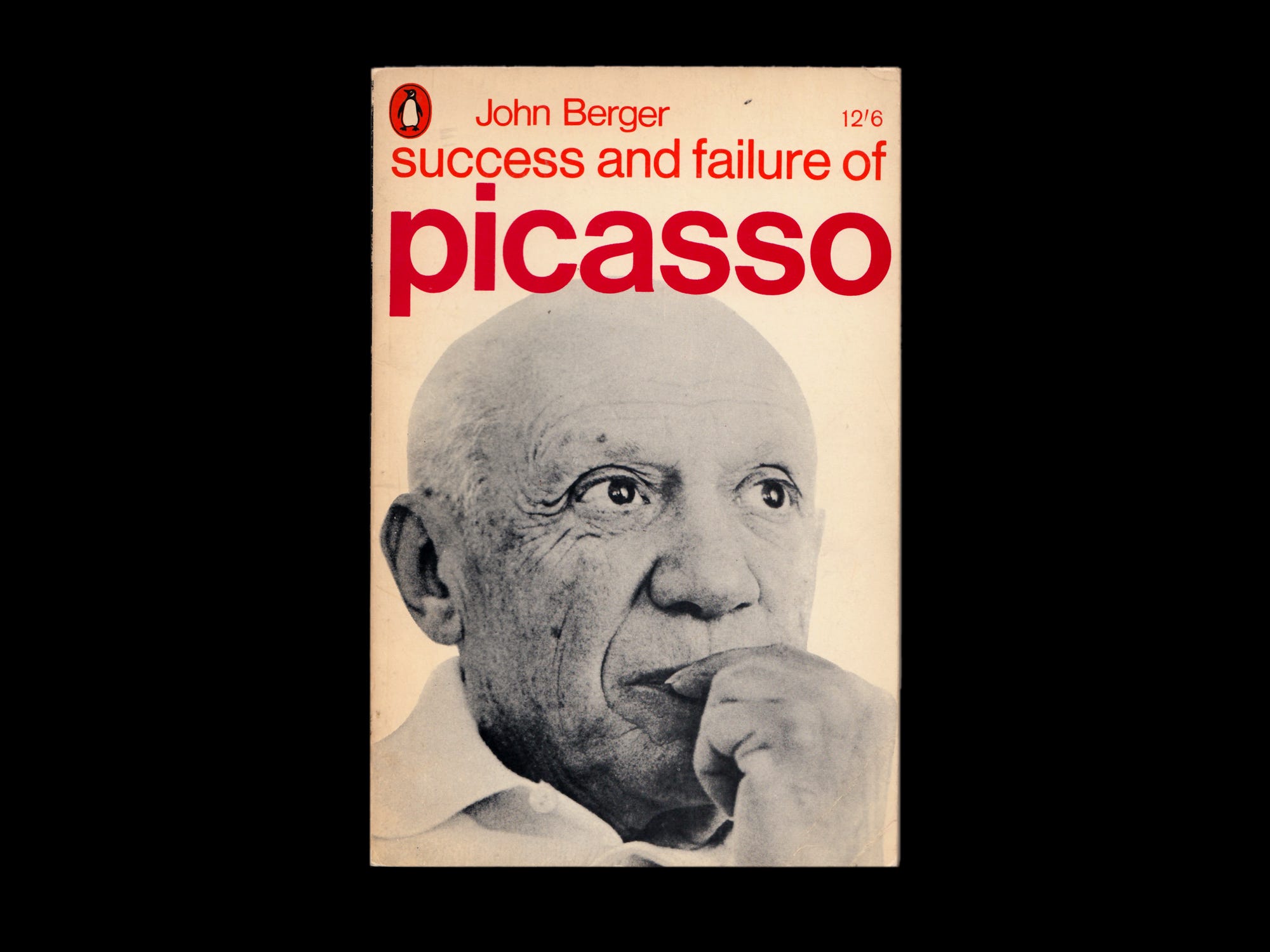
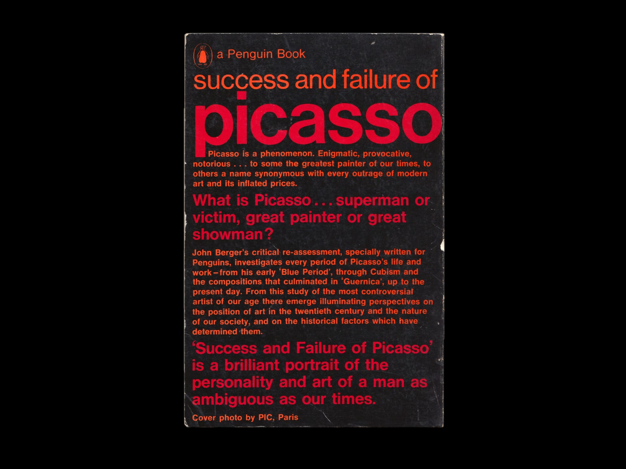
John Berger rose to prominence as the art critic for left-wing magazine New Statesman during the 1950s, a job he balanced while being a practising artist and a drawing teacher at Chelsea School of Art, where he had once been a student under the famous sculptor Henry Moore (whose work he would later condemn). Berger’s writing often caused outrage, with many disliking his distinctly Marxist and anti-elitist stance. He wasn’t afraid to attack the prevailing views of the art world or its leading artists. In particular, he opposed the idea of the singular artistic genius, something he discusses in his 1965 book The Success and Failure of Picasso, so his own preference for a collaborative and democratic working process is not surprising, especially given his political views.
His real breakthrough year was 1972, when the hugely influential BBC television series Ways of Seeing (directed by Mike Dibb) was first broadcast, and his novel G won the prestigious Booker Prize. His notoriety was boosted by his decision to give half of the prize money to the Black Panther movement as a protest against the sponsors historical links to the sugar trade and slave labour.
It was on G that Berger first collaborated with the graphic designer Richard Hollis. They had met by chance at a party, where they realised that Berger had once taught Hollis drawing. Hollis was also the art director of New Society, a magazine which Berger regularly contributed to. Berger was planning G as an illustrated novel, along the lines of André Breton’s Nadja, it ended up containing very few drawings but Hollis designed the cover, and also the inside of the book, which featured occasional experimental and symbolic typesetting.
The design of the interior was achieved by the two of them sitting together and working on it, cutting words where necessary and deciding where the typographic elements should be placed to fit with the narrative. When I spoke to Richard Hollis he reflected that he “always liked to sit with the artist or writer, because then you can ask them like an editor would, what is important and what can we leave this out, and that sort of thing”.
Berger, as an artist and writer, and Hollis as a graphic designer and writer (most notably of Graphic Design: A Concise History for Thames & Hudson in 1994), seems like the ideal collaboration to shape a book, especially given their shared left politics. This Hollis and Berger combo came to full fruition with the book version of Ways of Seeing, published by Penguin and the BBC in 1972, loosely following and expanding on the famous four-part TV documentary of the same name. Mike Dibb and Chris Fox from the BBC were also involved in the book, and artist Sven Blomberg provided wordless picture essays. The very first line of the book is “this book has been made by five of us”, Berger again was keen to move away from the idea of the solitary author, instead revealing the process behind the work. He also asserts that “the form of the book is as much to do with our purposes as the arguments contained within it.”
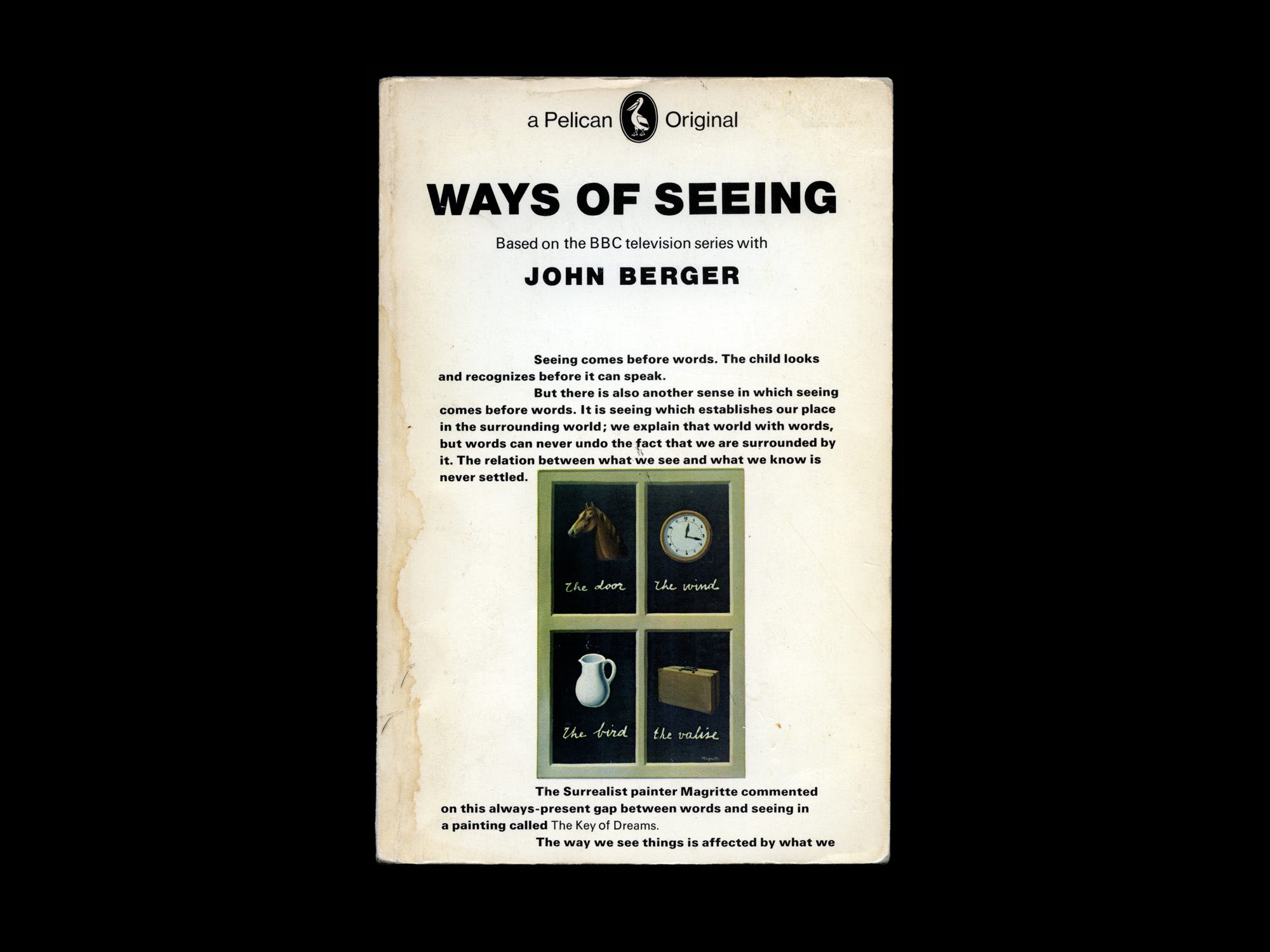
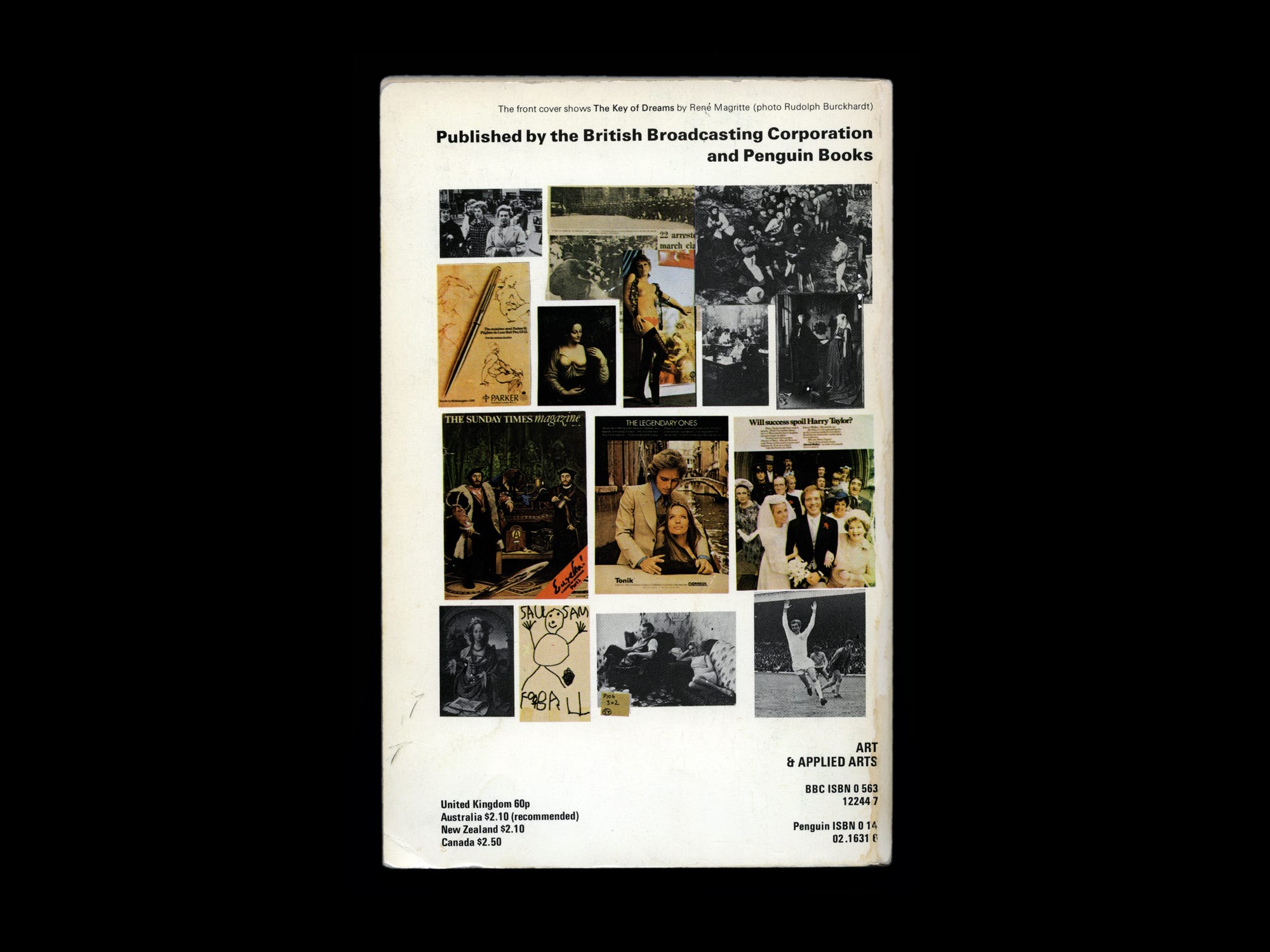
The cover immediately sets Ways of Seeing apart from its contemporaries, the book itself begins on the cover. Rather than creating a conventionally appealing cover, Hollis chose to bypass this tradition entirely, instead placing the text and an image from the start of the first chapter straight onto the front, just beneath the title and authors name. This directness has a link with the television series, mimicking how the first episode began with no preamble or title sequence, Berger got started immediately, drawing the audience in with his message rather than any distractions. Another link to Berger’s presenting style is Hollis’ choice of typeface, bold Univers 65 is used for the body copy throughout, in an attempt to achieve something of the captivating quality of Berger’s voice. A bold sans-serif was a radical choice at the time, when most art books used thinner serif fonts in a more traditional and mild manner. The conventional relationship between regular and bold copy is flipped on its head. The layout also employs large indents rather than paragraph breaks, something of a Hollis trademark. But this mirrors how Berger had presented on television, there was little time wasted with atmospheric filler shots or long gaps in speech, the message was key and continuous.
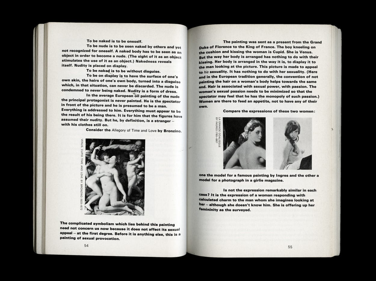
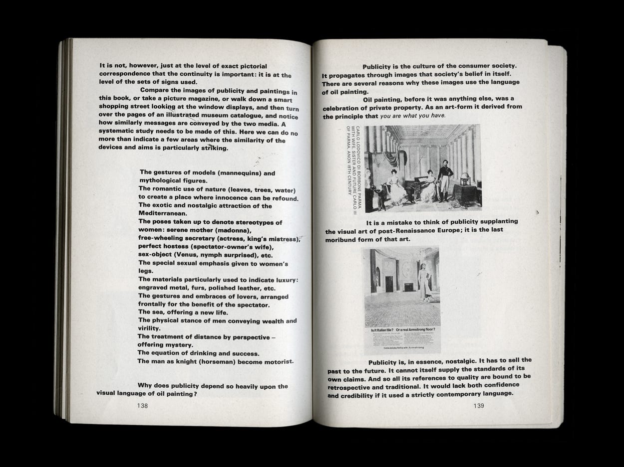

John Lewis, a typographer and tutor at the RCA, in the conclusion to his 1967 book The Twentieth Century Book: Its Illustration and Design predicted that graphic designers would “play a bigger part in the book of the future, not as one who provides a prettifying element, but as one who can act as an elucidating factor in the graphic presentation of a text”. In Ways of Seeing Hollis certainly achieves this, decisions are content driven rather than stylistic. The key reason that Ways of Seeing has become iconic as a piece of book design is how it dealt with text and image: the two are integrated, where an image is mentioned in the text it also appears there. Captions are avoided where possible. When unavoidable they are in a lighter weight of type and run horizontally, so as not to disrupt the text. Images are often set at the same width as the lines of text, or indented by the same amount, this democratises the text and image relationship. Occasionally works of art are cropped to show only the pertinent details. All of these features are a big departure from the art books of the time which usually featured glorified full page colour images, often in a glossy ‘colour plate’ section in the middle, completely distanced from where the text refers to them.
When I asked Richard Hollis about working with text and image together he replied, saying: “That was something I got used to working on magazines, I had to find images which illustrated points made in the text, and I got used to working in that way. We used to say that every designer should work on magazines, and you had to work to tight deadlines. You had to make decisions very quickly!”
This method of book design, integrating text and image, has its origins in modernism, for instance László Moholy-Nagy’s Typophotos and propaganda artist John Heartfield’s book designs. Hollis was also drawing inspiration from the work of the French film essayist Chris Marker, who had tackled the problem of turning film into a book with his two Commentaires publications, as well as an early version of Phaidon’s landmark book The Story of Art by EH Gombrich. For Hollis, Ways of Seeing has come to define his long and varied career (somewhat unwantedly perhaps): “it’s funny people always ask me about that book. I’ve answered so many things about it, it was just another job for me among many,” but the book is undeniably iconic, it has been in print continuously for over forty years and remains a key text on a huge number of university and college reading lists. Again the collaborative process was key, with the five contributors working together in a BBC office for two or three weeks until it was complete, Richard Hollis explained that this BBC involvement proved instrumental: “On that book I mainly worked with the television producers, we were lucky that despite it being with Penguin books, the BBC were in charge and told us to do it however we liked in the Penguin format. Hans Schmoller, who was a very traditional typographer and head of design at Penguin, hated it”.
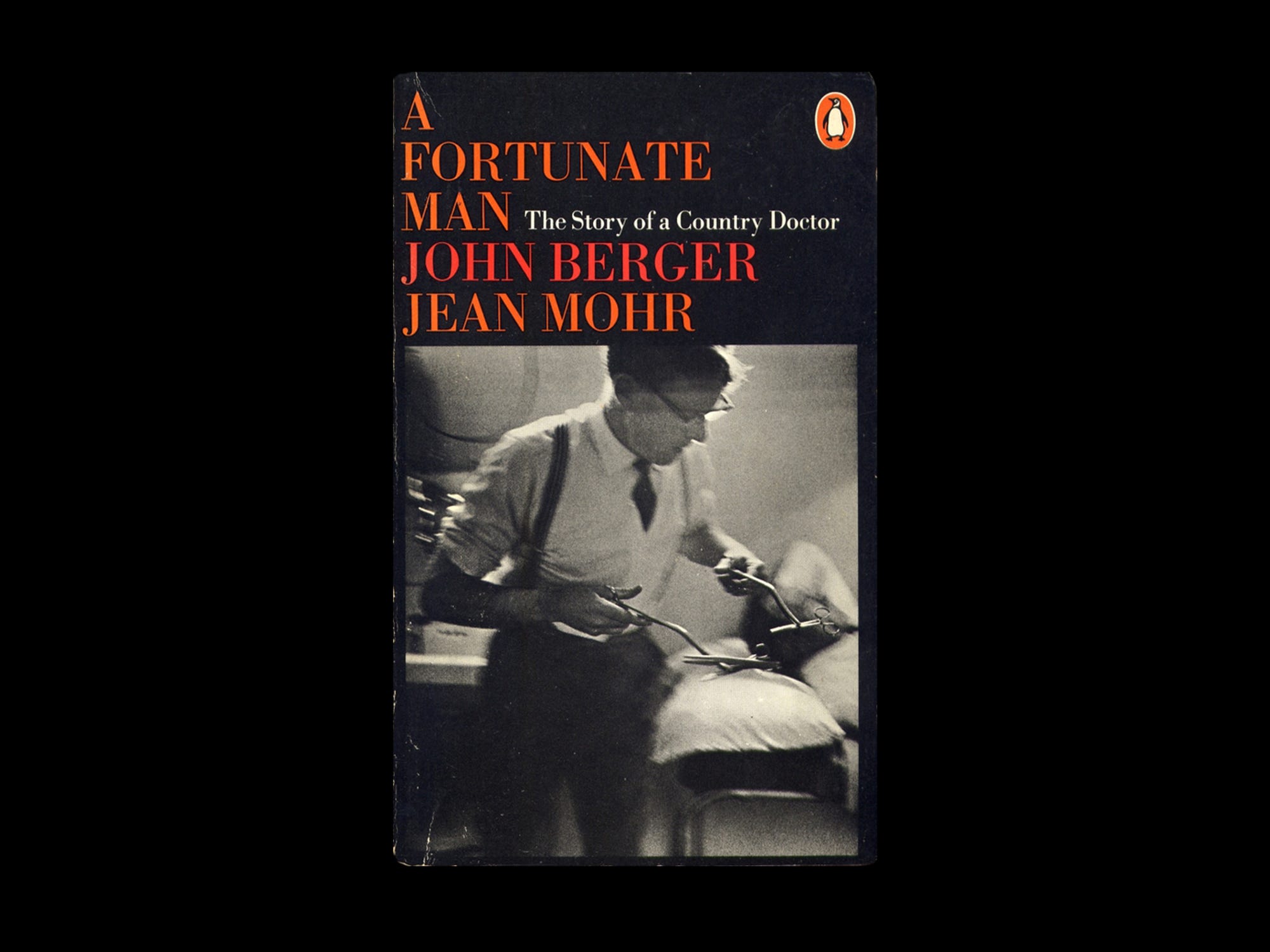
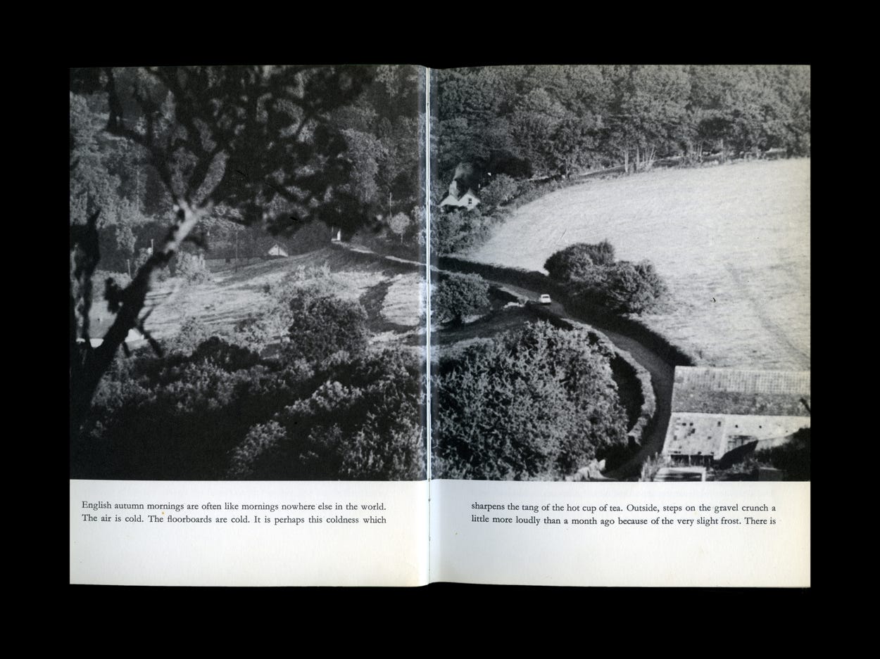
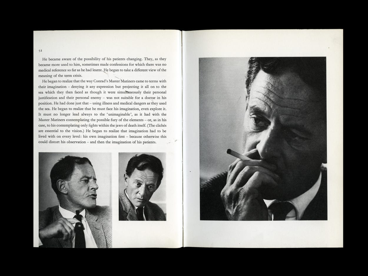
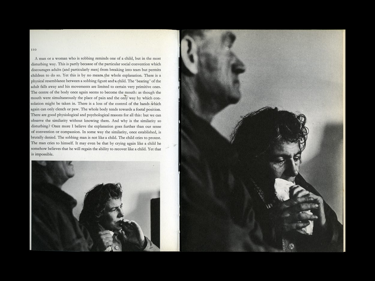
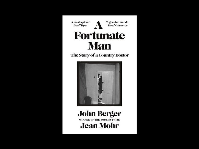
Before Ways of Seeing there was A Fortunate Man, first published by Allen Lane in 1967, this is another paperback book by Berger which uses text and image in unison. This time with the Swiss photographer Jean Mohr and Gerald Cinamon, a talented American designer working in London for Penguin. A Fortunate Man: The Story of a Country Doctor follows a rural GP called John Sassall (once Berger’s own doctor), and tells the story of six weeks of his working life with empathy, honesty and sensitivity. Mohr’s rich black and white images and Berger’s contemplative writing working together in Cinamon’s subtle and delicate layouts. This was Berger’s first attempt at a full book where images are integral, something he had got used to writing for magazines, and something he was drawn to ideologically too, inspired in part by Walter Benjamin’s The Work of Art in the Age of Mechanical Reproduction. In 1965, writing for issue 11 of the typographer Herbert Spencer’s publication Typographica, Berger declared that “nobody dares to place images as precisely in relation to a text as a quotation would be placed; few writers yet think of using pictures to make their argument.” A Fortunate Man makes a start towards this process which Ways of Seeing achieves more completely, yet it is still a beautiful and touching book in its own right, and shows a different side to Berger’s writing. Last year it was republished in a newly redesigned hardback format by Canongate Books, and this year the also published a new paperback version as part of their ‘Canons’ series.
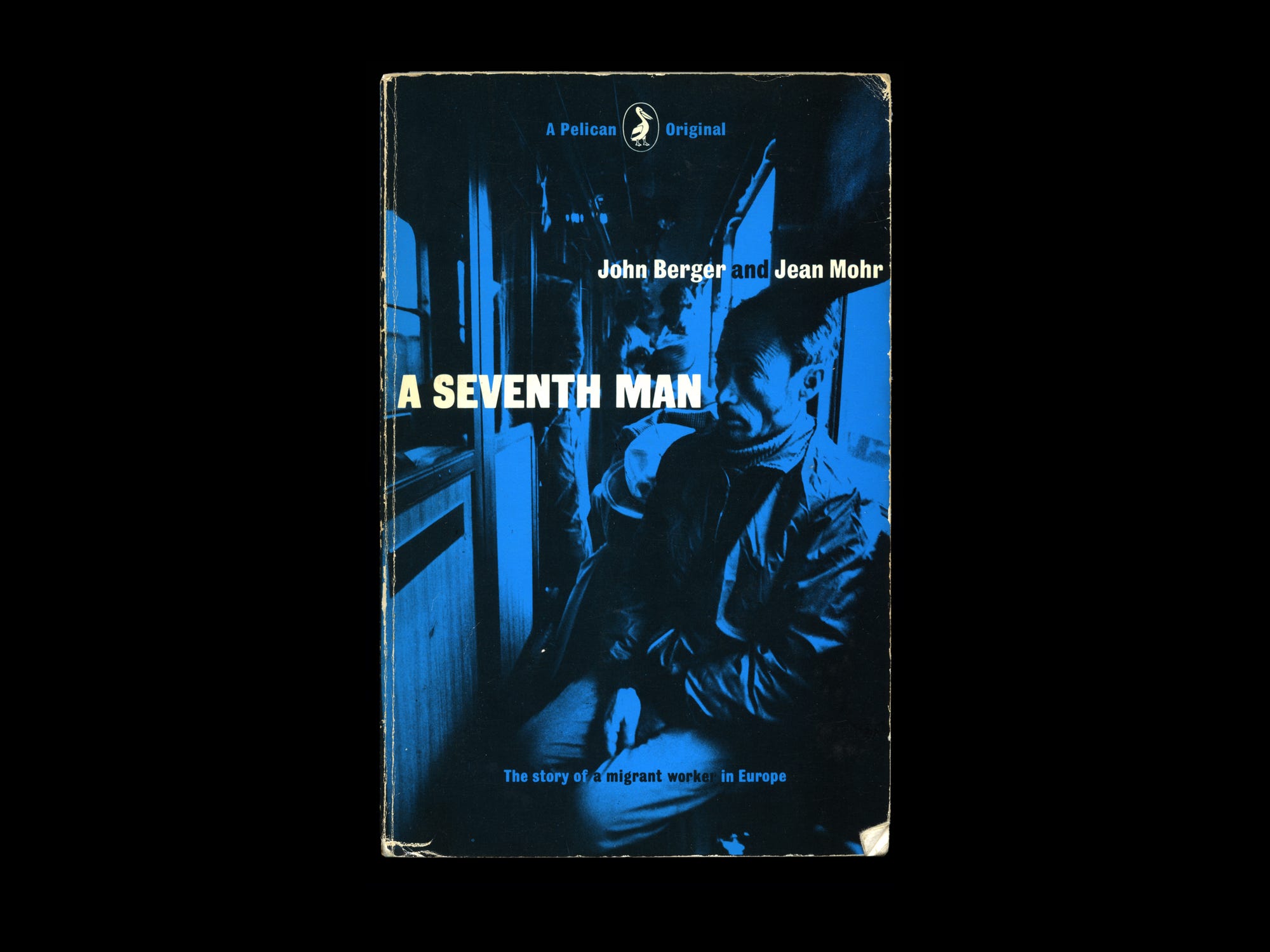
Following Ways of Seeing, Berger once again worked with the photographer Jean Mohr, using half of his G Booker Prize money to help fund A Seventh Man, published by Penguin in 1975. This book, ever relevant, focuses on the lives of migrant workers living in Germany. Berger explored the issues of exile, migration and the human experience usually hidden behind facts and figures, as well as the politics and economics at the root of the problems. This book was also designed by Richard Hollis with bold and utilitarian typography, but this time the text and image relationship is less obvious and direct, they don’t always relate to each other. It is more of a conversation between the two rather than a singular multimedia voice. Starting on the first page Berger states that “both should be read on their own terms… the photographs say things which are beyond the reach of words”. The end result is an extremely poignant and affecting book, and one that still has a lot to teach us in todays ‘migrant crisis’ about the real life experience and emotions of these exiles, and the worlds they leave behind, not by choice but by necessity.

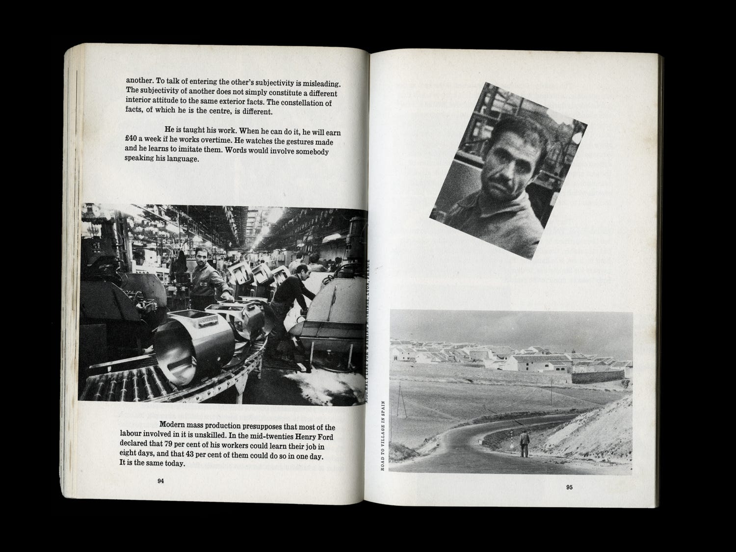
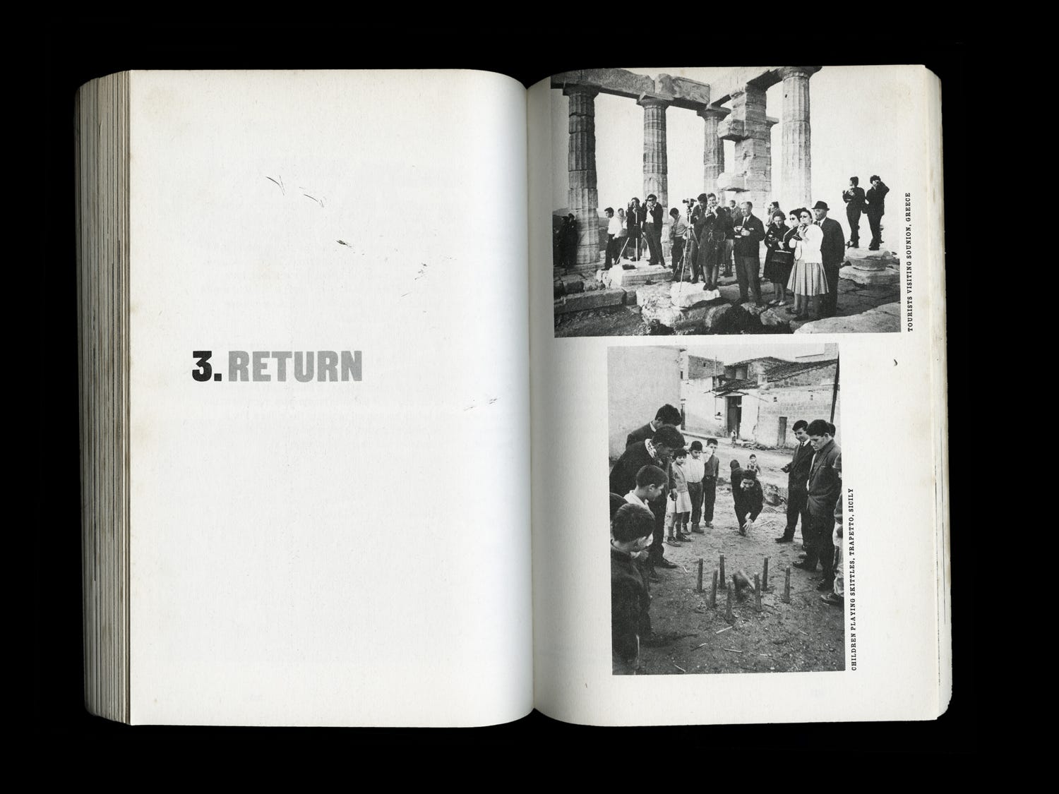
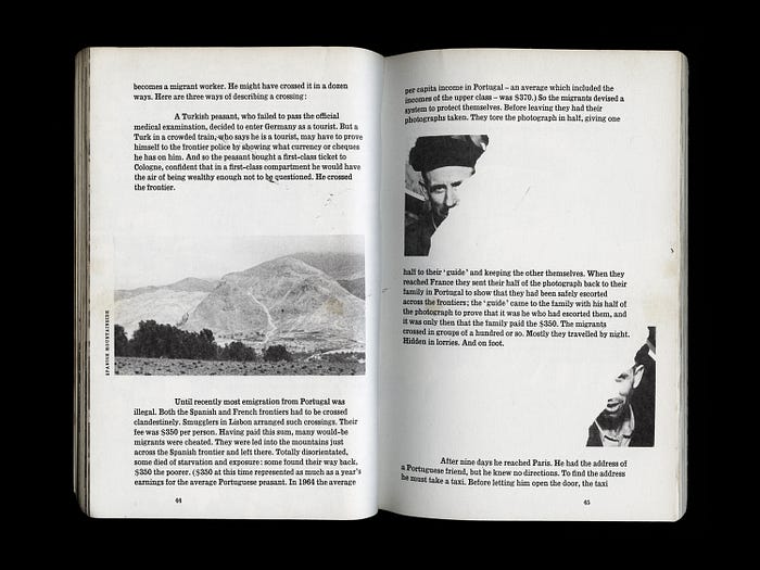
The design and format choices of all these books reflect Berger’s deep rooted political views and show how this can influence graphic design. Design is not used for prettifying, or to create appeal, rather it is used for elucidating, to spread his message or get his point across as clearly as possible. Be it a point about art and politics, art and gender, the ethics of advertising, the human experiences of a rural GP, or economic migrants in Germany — the design is always appropriate to what Berger wants to say, but does so economically without redundancy. Economics is an important point here, these are cheap books—paperbacks that fit in a pocket. The images are black and white, not high-quality, but it doesn’t matter, they serve their purpose effectively regardless. Even in Portraits: John Berger on Artists published by Verso in 2015, Berger insisted on black and white reproductions, arguing that: “glossy colour reproductions in the consumerist world of today tend to reduce what they show to items in a luxury brochure for millionaires. Whereas black-and-white reproductions are simple memoranda.” Tom Overton, editor of Portraits, explains in his introduction that the images in the book “illustrate the essentially dialectical relationship between text and image in Berger’s work: the pattern in which an image shapes a text, which then goes on to shape how we understand that image.” Overton also makes the point that Berger throughout his career has proven that “photographic reproductions can be a revolutionary language in their own right.”

For Berger an expensive, bulky and glossy coffee table style art or photography book would never be appropriate, these books had to be utilitarian, and affordable to as many people as possible. In fact Mike Dibb explained on a Verso Books podcast on Berger that the text of the first edition of Ways of Seeing is actually copyright free, so appropriately scans of the book are very easy to find online. There is even a site called Ways of Seeing WAYS OF SEEING which collects such PDF’s, revelling in the variety and weirdness of these digital versions. But looking at a copy of Ways of Seeing on a computer screen, especially a version where the pages have been split into single pages rather than spreads, really makes you appreciate how much use Berger made of the book format. How effectively such a simple thing could be used to spread such powerful messages. An inspiring use of just the double page and black ink.

Thanks to Caroline Roberts for originally publishing this piece on Grafik.net in 2016.
Further reading:
– The Electric Information Age Book: McLuhan/Agel/Fiore and the Experimental Paperback by Jeffrey T. Schnapp & Adam Michaels.
– “Ways Of Working” by Stuart Bailey.
– The Form of The Book Book edited by Sara De Bondt and Fraser Muggeridge.


